
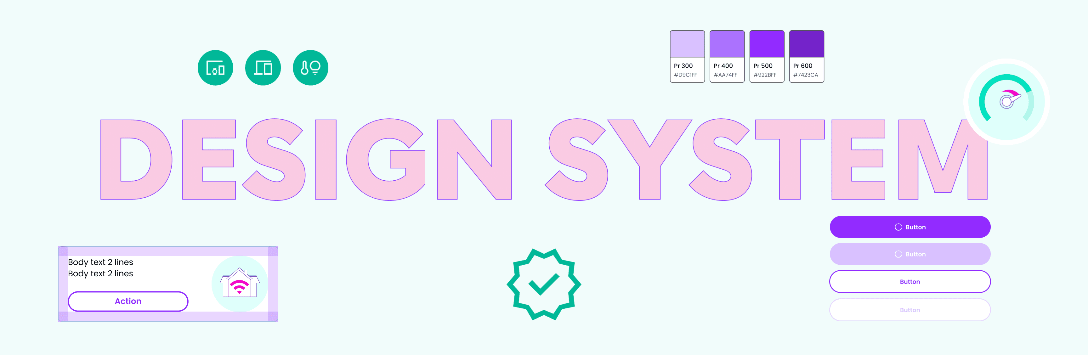
Gamgee: Design System
The Design System I initiated and built is both a toolkit for product development and an extension of the branding strategy, seamlessly integrating brand identity into the Gamgee app. With Figma variables, it transformed the app into a white label solution for ISPs (Internet Service Providers), capable of accommodating multiple modes to meet various brand guidelines and support multiple languages. This Design System streamlined collaboration between designers and developers by providing a shared language and a single source of truth for variables like colour, spacing, and typography. It enabled designers to make changes to components quickly, and developers to extract code directly from designs. Together with the creation of the Component Library, the Design System implementation significantly decreased both the design time and the development time, massively improving the efficiency of product development and its delivery cycles.
Team
DESIGN LEAD: Angelina Severino
DESIGN SYSTEM ADVOCATE: Angelina Severino
DESIGN SYSTEM ARCHITECT: Angelina Severino
DESIGN & STAKEHOLDER MANAGER: Angelina Severino
DESIGN MENTOR: Angelina Severino
COMPONENT LIBRARY DESIGNER: Katia Prutkova
DESIGN SYSTEM APP DEVELOPERS: Michael Chiou, Viktoriia Levchuk, Tasos Krikonis
A 2-minute recorded demo shows how my Design System allows for changes to be made very quickly for numerous elements: colour modes (light and dark), accessibility mode, translations to multiple languages.
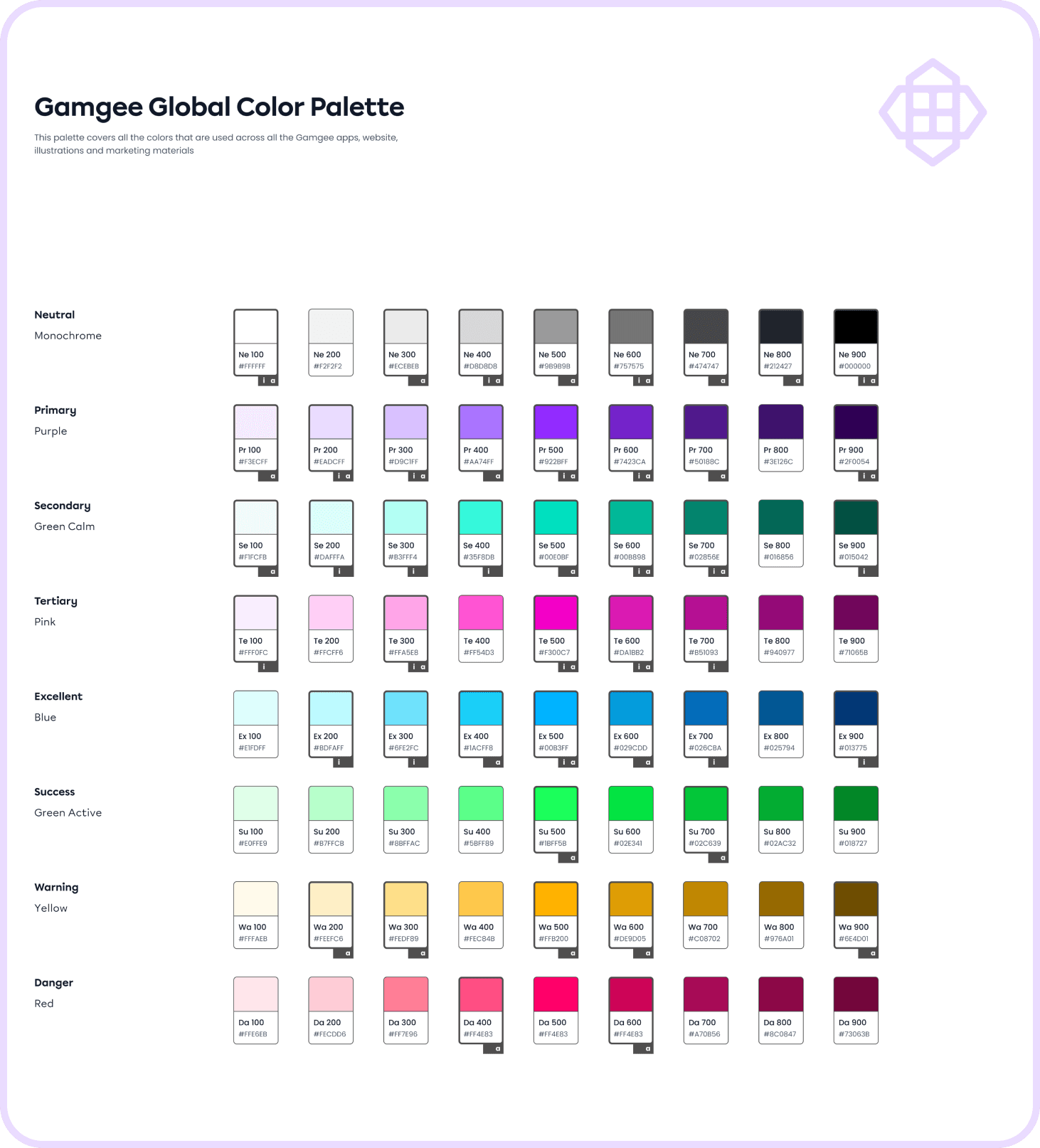
Global Colour palette (Primitives)
One of the first steps of setting up a Design System for the app was for me to define a functional colour palette (Colour Primitives) that addresses all the brand colours by their semantic names (e.g. Primary, Secondary, Warning, Danger, etc.) instead of their ”colour” names such as purple, green, blue, etc. This way it's possible to create a shared language between designers and developers, and create modes for colours based on their function in the app.
I labelled all the colours that are currently used for the app functional elements (”a") and app illustrations (”i") to avoid using just any colour from the palette but try to choose the ones that are already in use, unless it's absolutely needed for UI purposes. My goal was to limit the overall amount of colours in the app, and stick to a more strictly organised colour system to reduce the amount of colours to be stored in the app, and achieve better consistency and user experience with the app interface.

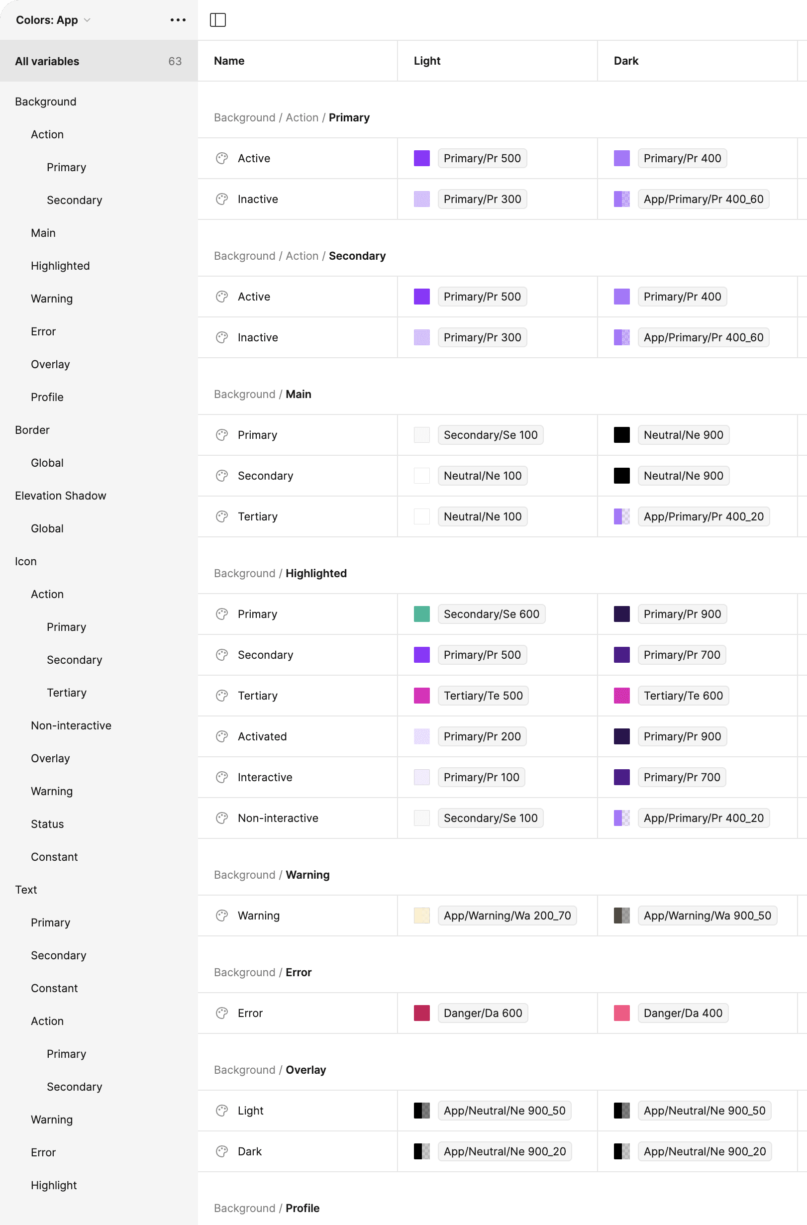
App colour system
This approach allowed me to create a scalable Colour System rooted in Colour Primitives and assigned a second layer of semantic (functional) names such as Action - Primary – Active / Inactive as an example, creating a variable instead of a simple colour value.
The preview shows the example of functional app colours for all types of Backgrounds in the app (Action, Main, Highlighted, etc.), but such tables are also created for Border, Elevation shadow, Icons, Texts, and Illustrations – both for light and dark modes.
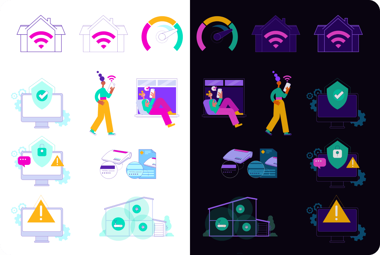
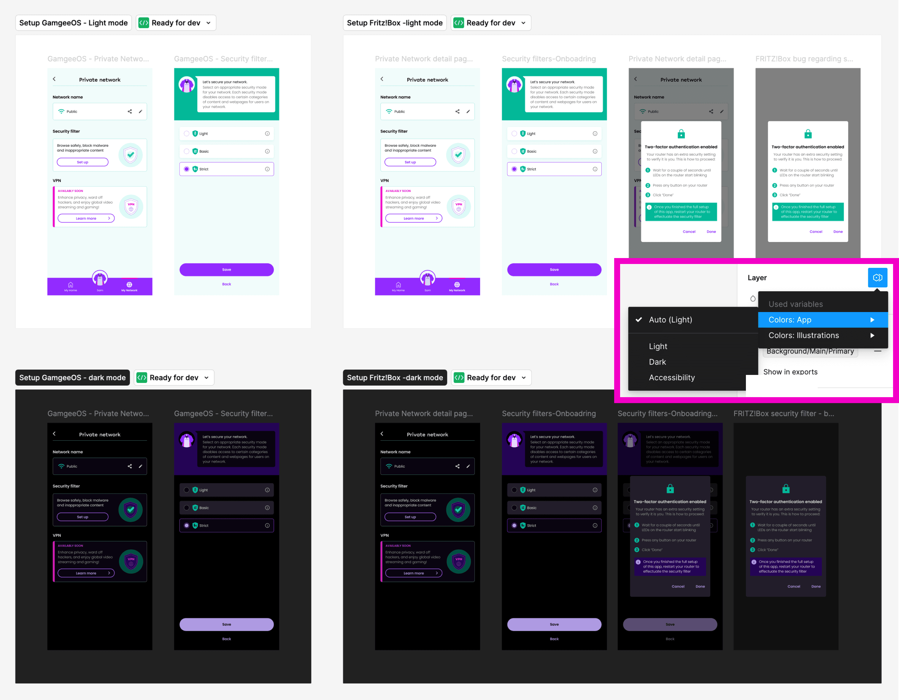
Example of the Colour Variables applied to the in-app illustrations: in one click the mode changes from light to dark
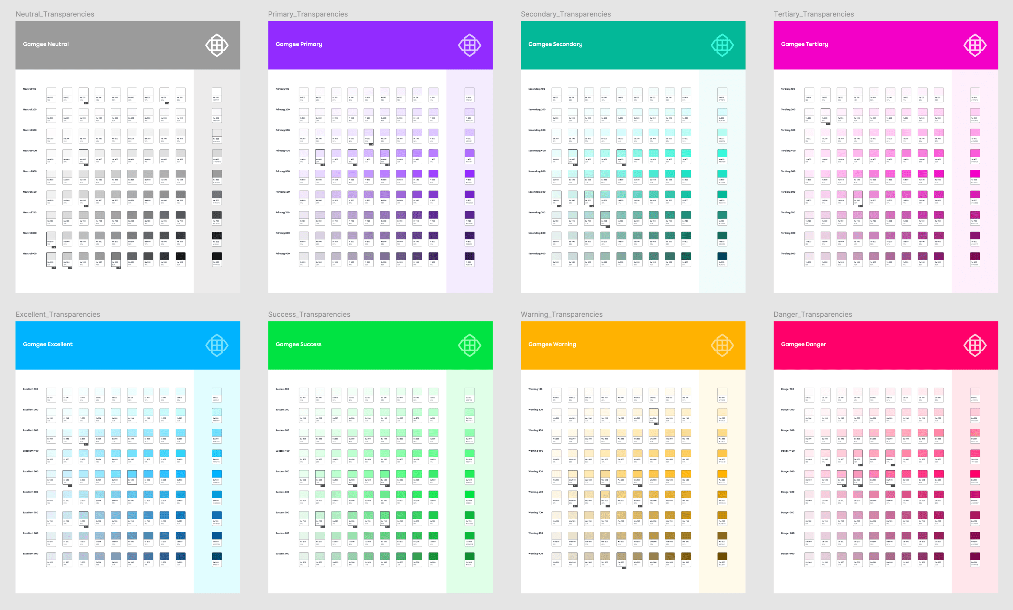
Transparencies palettes for each Primitive Colour from the Global Colour Palette, to achieve more colour variation and effects for UI purposes
Colour variables
I implemented the Colour Variables Table in Figma, which is a powerful tool that allows designers to manage and apply colour schemes across an entire app with remarkable efficiency. By defining a set of colour variables – such as primary, secondary, background, and text colours – designers can easily control and update the app’s colour scheme. When a colour variable is adjusted in the table, every element linked to that variable is automatically updated throughout the entire design, ensuring consistency across all screens and components.
This setup was especially beneficial for the Gamgee apps as it has multiple modes, like light and dark themes, and it's a white label solution where brand colours need to be quickly swapped to match different ISPs. With just a few clicks, designers can switch between colour schemes or update modes for the entire app, drastically reducing the time and effort required to implement brand-specific adjustments.
Transparencies palettes for each Primitive Colour from the Global Colour Palette, to achieve more colour variation and effects for UI purposes
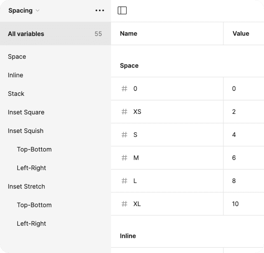
Spacing variables
Another key component of the Design System is the Spacing, which plays a crucial role in maintaining a consistent and harmonious look across the app. Understanding the importance of maintaining logical relationships between elements, I set up these spacing values as variables, which allowed for easy adaptation across different screen sizes—whether mobile, tablet, or desktop. This approach not only ensured design consistency but also streamlined the process of adjusting layouts for various modes. By defining spacing as variables, I enabled our team to make quick, uniform changes, preserving the design’s integrity and enhancing the overall user experience across all devices.

Typography variables
I set up Typography Variables to give our team the flexibility to quickly change font families and specific fonts across the entire app, which is essential for a white-label solution that needs to meet diverse brand guidelines. By defining font properties as variables, we could easily adjust typography for all screens at once, ensuring consistency and allowing for rapid updates when needed. Additionally, I created different modes with font sizes and line heights tailored to various devices, ensuring that text is always legible and well-proportioned, whether on mobile or tablet.
Translations variables
To accommodate multiple languages seamlessly, I implemented Translations Variables within our Design System. These variables allowed us to preview and implement the app in different languages with just a few clicks, ensuring that text elements are correctly adapted for various languages and cultural contexts. This setup makes it easy to switch between language modes, providing a smooth and efficient way to localise the app for diverse markets without compromising on design quality or user experience.


A one-click switch between language modes for the app screens and elements
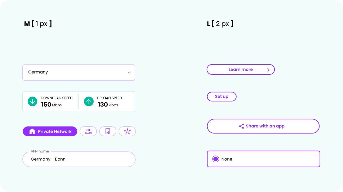
Border Width variables
Border Radius variables
Effects as variables
Defining elevation shadows as variables brings significant benefits by ensuring both flexibility and design consistency. Even in dark mode, where elevation shadows might not be even visible, they still need to be present to maintain the integrity of the design system. With shadow properties like colour, blur, spread, opacity, etc. set as variables, we could quickly fine-tune the depth and dimensionality of elements throughout the app, ensuring a uniform visual style across all screens and modes. Whether the design calls for subtle or dramatic effects, having elevation shadows as variables simplifies the design process and empowers the team to create visually cohesive and polished interfaces with ease.

Elevation Shadow variables
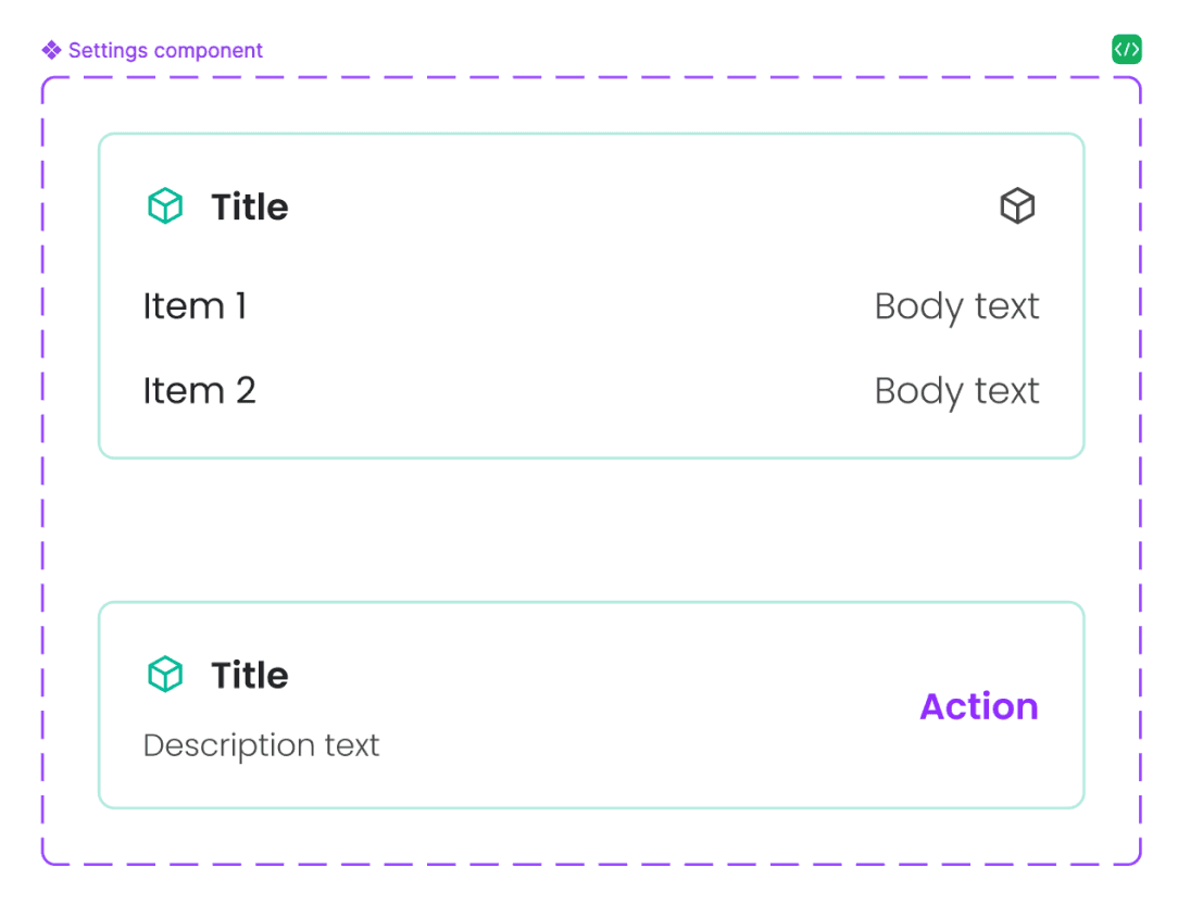
Component library
Together with the UX/UI designer, I developed a comprehensive Component Library with variables integrated into every element, making the app’s design as modular and adaptable as possible. This library functions like a digital constructor, where the app is built piece by piece using pre-defined components. By embedding variables into each component, any changes or adjustments – whether in colour, spacing, typography, or other design elements – can be implemented in seconds and automatically applied across the entire app. It ensures consistency and significantly accelerates the design and development process, allowing for rapid updates and seamless scalability.
Scalability
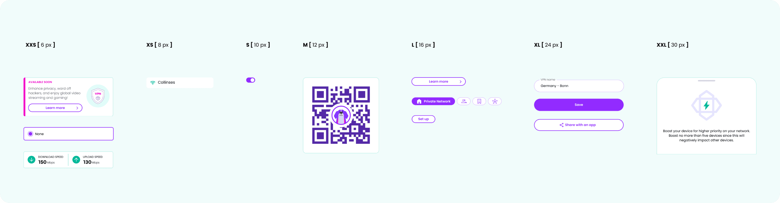
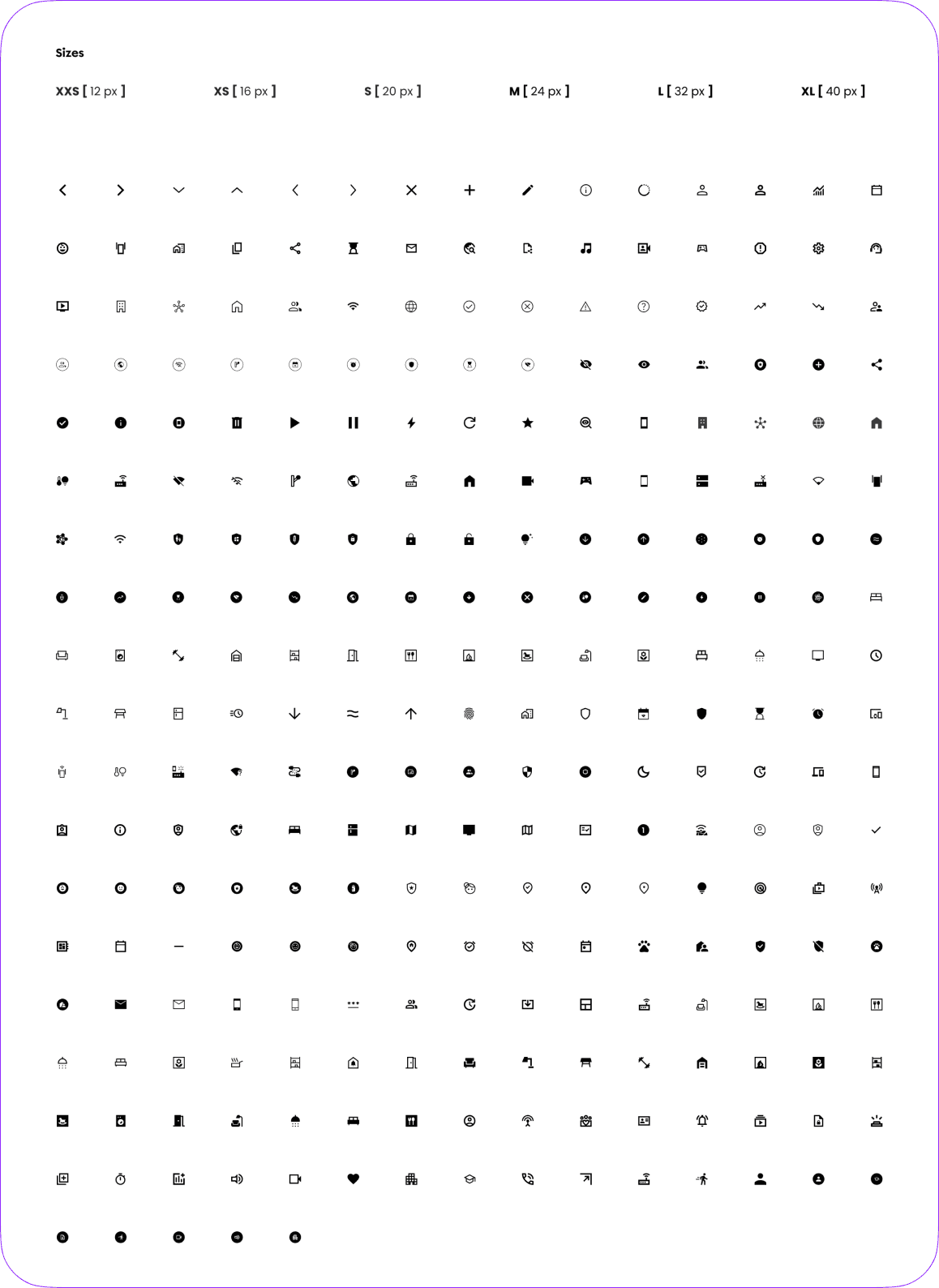
We created a scalable Elements Library where all the ”atom” elements (icons, illustrations, etc.) are stored in a standardised size, making them easily findable and organised for efficient use. Despite the uniform storage size, I also established clear guidelines for their suggested sizes in actual application, ensuring that each element is used appropriately across different screen sizes and contexts. It allowed the team to quickly locate and implement the right elements, while the size guidelines ensure that the design remains consistent, flexible, and visually balanced throughout the app.
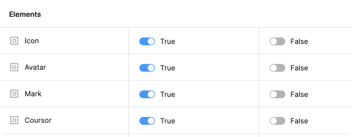
Boolean variables
We implemented Boolean Variables in Figma to create a single ”source” component for every component in the app, that would contain all the possible functional elements inside. Instead of designing multiple component variants for different scenarios, we could now use true or false statements to control which elements are visible or hidden within that main component. It greatly simplifies the design workflow, as designers can easily toggle elements on or off and save their choice as a separate mode – to be able to choose between different functionalities, all within the same element. The result is a more efficient, flexible Component Library with less variants of the same components, which reduces redundancy and ensures consistency across the app while giving designers the freedom to customise components quickly and easily.

Conclusion
Establishing an effective Design System was crucial for creating a cohesive, scalable, and efficient product. It ensures consistency across all aspects of the design, from typography and colour schemes to spacing and component behaviour, while streamlining collaboration between designers and developers.
As the Design Lead and advocate for this project, my role was to champion the creation of a robust Design System that not only met the complex needs of a white-label solution but also empowered the team to work more efficiently. By integrating variables, creating a comprehensive Component Library, and implementing scalable solutions like Figma Variables, I helped transform our design process into one that is adaptable, organised, and capable of delivering high-quality results quickly and consistently.
This approach elevated the product's design, and set a strong foundation for future product growth and innovation.